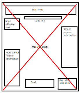
Layout 1:
This layout I have created shows ideas of where I plan to put things in my front cover if i choose this layout. The mid shot photo is of a teenage student and is placed through the whole background so has the text in front of it to give it a good effect and the photo of this teenage student can be observed easily. Text is placed around the sides of the front cover so the photo can be noticed and the text can be read around it. The bold texts and will show the most important information as it will stand out the most. The mast head is located at the top of the magazine so it can be noticed quickly what the magazine is called and will be presented with a strap line underneath to show any valid information about the magazine which can be read quickly. I feel that this layout is the very appropriate and would fit well for my college magazine.
Layout 2:
 This second layout I have created i feel is more creative and interesting. This layout I formed together is much more different than my first layout. This shows the normal mast head and strap line at the same as seen in the first layout. But instead this layout shows a mid-long shot photo in the centre of the page with text to the right of it and to the left showing the bar code and price, and text saying win a free c-d! This will include a picture of the c-d behind the text where it says this. This is useful as my target audience are mostly quite young in teenage years and are most commonly known for there interest in music. Also a very different part of this layout is that it includes another photo at the bottom of page which is an extreme long (wide) shot showing students outside of the college which relates to my target audience. There will also be a background colour of dark blue to adapt with my text which will be white.
Out of these two layouts I have created I feel that my first layout I made is the most appropriate and suits better as a front cover for magazines. The photo in this layout covers the whole front cover and seems more professional as the text is in front of it image and is divided into both sides so that the photo is still visible and information can be set around the main part of the photo and can be read easily. I like this layout and I feel it will work well as my front cover.

No comments:
Post a Comment