Tuesday, 16 November 2010

College Front Cover


This is College Calls front cover.
 This is my magazine front cover for 'College Calls'. I have made a few changes from my layout which has helped me produce what I feel is a very good final front cover. My research, planning, and results from tests have helped me a lot to get a good understanding about what people in my target audience think and how to structure a good magazine. I have used these fonts and colours because I feel it suits a good colour scheme to make the magazine stand out and to not over flow with colours. I have used white font because it stands out well and reacts well with blue, the colour scheme I have used of blue, white and some black links together well. These aspects I have used should work well to attract my primary audience of people of both genders, of the age 16+ who go to college and also the secondary audience of 14+ of both genders who are intereseted in college, sport etc.


This is my mock out of my College Calls content page.

This is my mock out for my contents page in my 'College Calls' magazine. This has a similar colour scheme to the front cover with the same use of blue, but this time it includes a colour scheme of dark blue, light blue, and a blue/grey background.


Teenagers are normally given a bias approach and are seen as rude, and blamed for a lot of things that happen, they are seen by a lot of people mainly the elderly that they are nothing but trouble and like to cause trouble. My magazine cover shows a different approach to this and shows my teenager in my front cover smiling in smart clothes holding a book, looking happy and eager to learn and very innocent. This makes teenagers look more appealing and professional to the world and are given a better name as they are usually stereotyped in a bad way.

Planning

I plan to have my magazine and magazine front cover to be aimed for teenagers who go to college. Hence why my magazine is called 'College Calls'. I am planning to have my front cover to include a photograph of a student holding books to show he is a student who is there to learn. I will place this student in a working (college) environment to represent he is in a college. I am most likely going to make this person a male to include in my photo for my front cover and will make him dress in smart clothes (shirt and tie) to make him seem more professional and eager to learn. He will be holding books and smiling to show that he is happy where he is and is happy to be at college, a smile shows a positive attitude and positive aspects are required to engage my target audience. I am going to plan out my front cover and contents page and see what I feel suits my magazine the most to suit teenagers.

Location And Shots 

I have taken several photographs of this student in different shot and different locations, I have cut down the amount of shots I have taken and I am left with the three shots I feel are the most successful. I have looked at many locations to have as my foreground for my magazine. I have been outside a school/college, been inside classrooms and many others to find what I feel fits for the best background. I have decided the location of inside school premises is the best as it sends the message of students inside a working environment suits to my magazine of a college and with the positive body language of this student it makes the image look a whole lot more effective.

 This shot is a long shot which shows more of this student who is shown holding a book showing he is in a learning background whilst leaning against a row of lockers. This photo is good as it shows he is happy (smiling) whilst looking at the camera. Also the colours used are successful as he is wearing blue which relates to the lockers he is standing next to and doesn't cause a clash of colours. On the other hand this shows the student with one hand in his pocket and leaning against a locker which could be seen as unprofessional and is left with a wide space on the left hand side which isn't taken up by anything important but corridor space.

The location for this shot is much the same as my first photograph i have taken. The difference from this photo is that the shot is taken more closely more of a mid-shot, which shows from the waste and up. The student is placed in the middle of the of shot and shows the row of lockers on the right hand side which still relate to the colours he is wearing which is blue. I like this shot as it shows the student is happy in his surroundings and shows a lot of room for information in my front cover. This is a shot which has not been cropped to size to cut out different parts of an image. This is a natural image I feel doesnt need cropping and looks effective as it is.


This final photograph is in a different location which is a white background which adds good affect for a magazine front cover as it draws more attention towards the person in the photo and the information around it. He is still holding a book whilst wearing appropriate information but this location makes it seem a bit more unique because of the white background, the white background may be portrayed as 'shinning' towards something (the student). There is plenty of room around this photo for text for the magazine cover to accept and shows a lot more of the student standing tall, smiling.


Mock Outs
 This is a mock out of my magazine front cover I plan to do. I have changed some parts of the layout I have done in my researched. I have included a FREE aspect for the magazine which is included on the left hand side of the cover and surrounded by a star to make it seem more appealing and fun. My mast head is located at the top in the middle with a strap line underneath. On the right hand side includes my text about the magazine, text which will appeal the reader to be interested with my magazine and hopefully appeal to like and buy it. Below this is my bar code and price. Below my star on the left hand side shows more aspects which include news, and sports to hopefully interest the reader more to relate to some viewers interests more as sport can be seemed as fun and exciting for a lot of teenagers. The style of a front cover has to be realistic and appropriate so it is seen serious and appeals to different audiences for them to like the magazine. I feel the layout and aspects i have done and going to put in my front cover give it a much more professional look and shows the reality of college through the designing i have put forward.


This is my mock out view of my contents page. My contents page will be shown easily that is my contents page as 'Contents Page' will be bold in big font underlined and slightly slanted to make it seem more fun than rather it being in the middle in normal fonts, this way it is shown in a more interesting way. These mock outs give me a good view of what my actual covers would look like and gives me a good chance to plan them and make chances where appropriate like I have done in my front cover. On the left hand side includes of two photos, one being a long wide shot of the front of the college giving a good and positive view of the college and underneath this is another photo of a student in a science lab with goggles and a jacket on to give a science effect as this college is aimed for many subjects but each magazine series it will include a different picture of each subject each time. On the right hand side it shows the page numbers and the contents of each page. It shows the numbers and next to it what is on each page.

Testing and Results

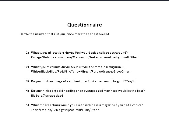
I have constructed a questionnaire about my magazine and handed it out to people of the age of 16+ and have it to people who mostly go to college or sixth form to get there opinion on what they feel about my magazine and hopefully these results can help me to make my magazine seem and appeal more for my target audience and to have a better magazine. This is a screen shot showing the questionnaire I have designed and handed out.


This questionnaire I have created I feel has valid questions which can help me with my research in order to give me good ideas from people in my target audience, to find out there views on magazines and how this can help me to develop a better front cover.

My results:

Q1) Shows results of the majority of people preferred a college background to be set inside a college.
Q2) The majority of my results shows must people preferred blue and white colours.
Q3) The majority of my results shows must people preferred an image on the front cover instead of anything else.
Q4) The majority of my results shows must people preferred a big bold heading rather than an average sized one.
Q5) Finally he majority of my results shows must people preferred sport the must as an extra section to include in my magazine.

These results are good as it helps me to understand what people in my primary target audience feel about magazines that appeal to them and helps me to understand what i can include in mine to make my magazine better and more interesting for them to read.

I have also done a poll on my blog to see what some people think about different types of magazines.

The Task

The task we have been set for our AS Media coursework is to construct a new school/college magazine, this is our preliminary task. Our main task is to create a music magazine. Throughout this blog it is going to show my research, planning, testing and results, and much more to show what I have done and going to do for my magazine covers and to find out what I think are the best aspects to include in my magazine.

Thursday, 11 November 2010

Genre:

There are many types of genres which represent what something is in a category. This can be based in many forms such as films and magazines. Different types of genres for magazines could be sport, music, education, gaming, fashion, nature, celebrity gossip, and many more which are adapted to suit that genre and are aimed for audiences who are interested in that category. If my magazine was set in a genre it would be in education as my magazine is for college students, but this magazine could also exist of having a hybrid genre of sport or fashion so that it appeals more for the students as they may be in to fashion or sport so therefore there may be more reason for them to read this magazine.

Audience

My target audience for my magazine will be for students of the age of 16+ who go to college. I have used different types of techniques to relate to this niche audience as I hope they are the ones who read and get appealed to this magazine the most. This magazine is aimed for any type of students who go to college from all races, ethnicity, and gender etc. As I am in the same age range as this audience it won’t be as hard to find out what this age of people like and are appealed to as I can use my own general knowledge and ask my peers who I go to sixth form with and ask them questions and get results to help my research which I have done through the course of my work (questionnaire). I hope to catch the eye of this audience through the use of colours I use, images, fonts, layout and much more. As my college will be a college for many different subjects (not one subject based) I feel that i need to appeal different types of people who are interested in different types of subjects to make them want to read this magazine so they know it is not just appealed to one subject which it isn't.

Design Research - Layout

Layout is a very good piece of research to do as it helps you to structure where you are going to put different parts of your magazine cover. I have researched and looked at a lot of different college magazines and have got a much more in depth view of what front covers look like and I have constructed my own layouts for preparation for making my own magazine.

Layout 1:

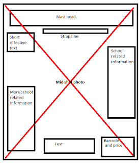
This layout I have created shows ideas of where I plan to put things in my front cover if i choose this layout. The mid shot photo is of a teenage student and is placed through the whole background so has the text in front of it to give it a good effect and the photo of this teenage student can be observed easily. Text is placed around the sides of the front cover so the photo can be noticed and the text can be read around it. The bold texts and will show the most important information as it will stand out the most. The mast head is located at the top of the magazine so it can be noticed quickly what the magazine is called and will be presented with a strap line underneath to show any valid information about the magazine which can be read quickly. I feel that this layout is the very appropriate and would fit well for my college magazine.


Layout 2:
This second layout I have created i feel is more creative and interesting. This layout I formed together is much more different than my first layout. This shows the normal mast head and strap line at the same as seen in the first layout. But instead this layout shows a mid-long shot photo in the centre of the page with text to the right of it and to the left showing the bar code and price, and text saying win a free c-d! This will include a picture of the c-d behind the text where it says this. This is useful as my target audience are mostly quite young in teenage years and are most commonly known for there interest in music. Also a very different part of this layout is that it includes another photo at the bottom of page which is an extreme long (wide) shot showing students outside of the college which relates to my target audience. There will also be a background colour of dark blue to adapt with my text which will be white.


Out of these two layouts I have created I feel that my first layout I made is the most appropriate and suits better as a front cover for magazines. The photo in this layout covers the whole front cover and seems more professional as the text is in front of it image and is divided into both sides so that the photo is still visible and information can be set around the main part of the photo and can be read easily. I like this layout and I feel it will work well as my front cover.

Wednesday, 3 November 2010

Design Research - Fonts

These are some fonts I have tested out in Microsoft word to see what they would look like as text in a college calls magazine.

I have tested a variety of fonts with the words of my magazine front cover (college calls) to see what fonts would look the most appealing as text in my magazine. I have chosen the font Arial Black to have as my text in my magazine. I feel this font is the most appropriate for my college magazine as it is basic and easy to read but it also provides a unique look about it which makes the letters appear a bit more different and fun, the use of the fun and bold font makes the magazine text seem a lot less boring and a lot more fun and is more likely to appeal for teenagers instead of having a standard, boring font. Also this font is in bold and stands out easier for the reader to read.